

… An Idea brave enough to separate the brand but risky enough to never make it to market… But… It did.
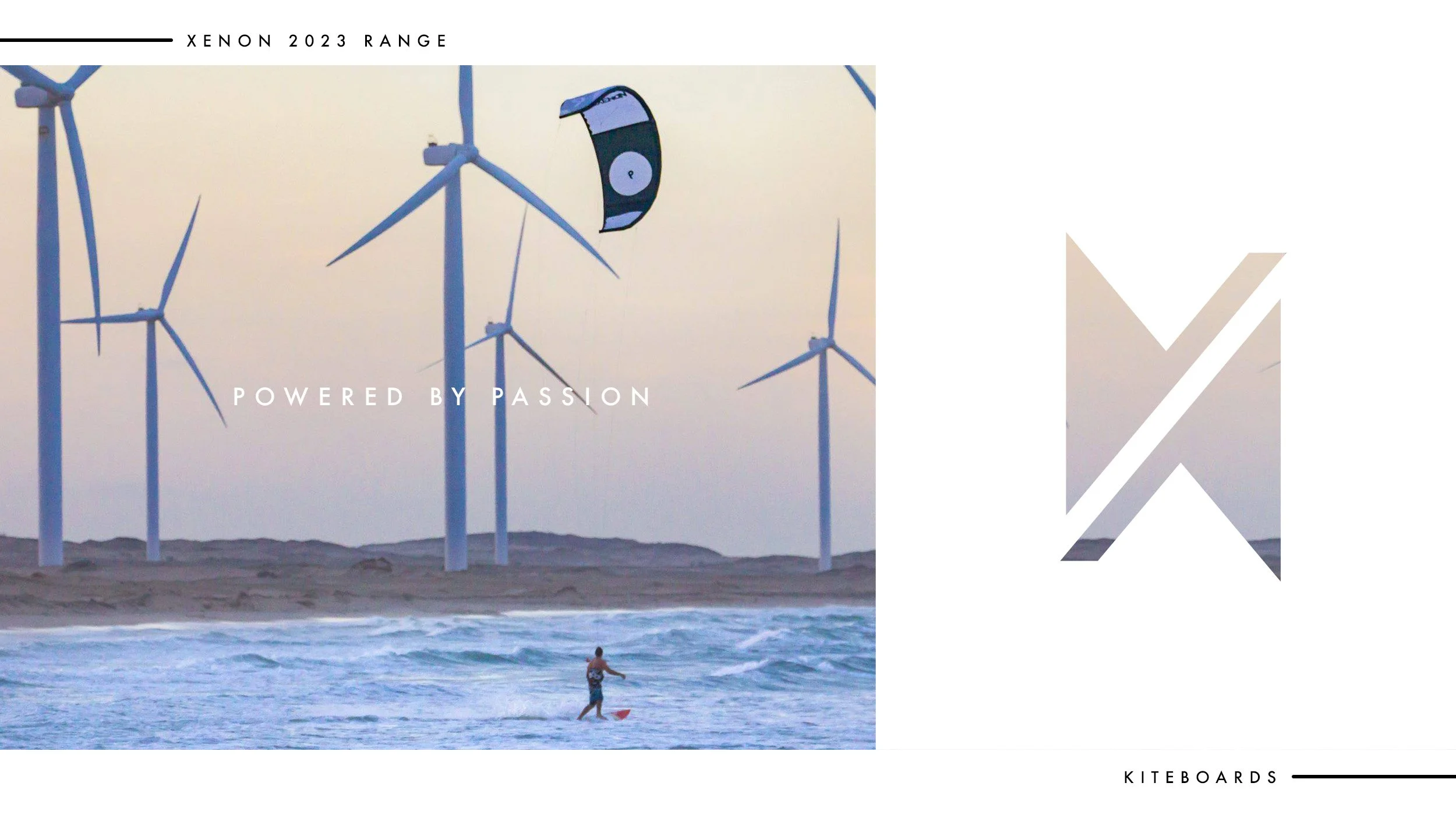
There’s a unique buzz that comes from seeing your own artwork hurtling across the sea at 30 knots. That’s exactly what I felt when the new Xenon kiteboards hit the water this season – the culmination of years of design, development and graft. With a few unexpected plot twists along the way.
Here is an insight into the second round of board designs going to market. In here is a concept idea I pitched to the owners. An Idea brave enough to separate the brand but risky enough to never make it to market… But… It did. A truly unique, gold embellished, Limited Edition concept board. It’s a beast, built for riders bold enough to make a statement, it sits comfortably on the fringes, breaking the conventions of the Xenon brand.

I’ve been working with international kiteboard company Xenon since 2021. What started as a shared passion for the sport has evolved into a creative collaboration that’s taken on a life of its own.
Working with the owners, investors and marketing team we’ve gone from board design to an entire website revamp, design strategy development, garment design, social media / catalogue campaigns and even a mural for the head office.
Inside the Design Process
Identify market trends and do the opposite
Create unique artworks that can exist as a family
Explore possible narratives for developing the brand identity
Honour current customer base
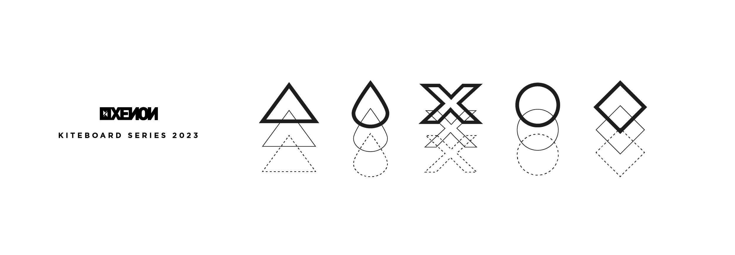
Our primary objective was to break from the traditional approach to kiteboard design, based purely on aesthetic. To do this we build a concept for each board design. We focussed on an element, something specific to the sport, a technique, a feeling, something Kiters could relate too. We then created a unique emblem for each board that would exist as a family of products, a range. An abstracted identity that kiteboarders could make their own. To honour the Xenon style and to not alienate existing customers we kept the designs clean and minimal.
Each board design draws inspiration from ever evolving concepts.

Adrenaline
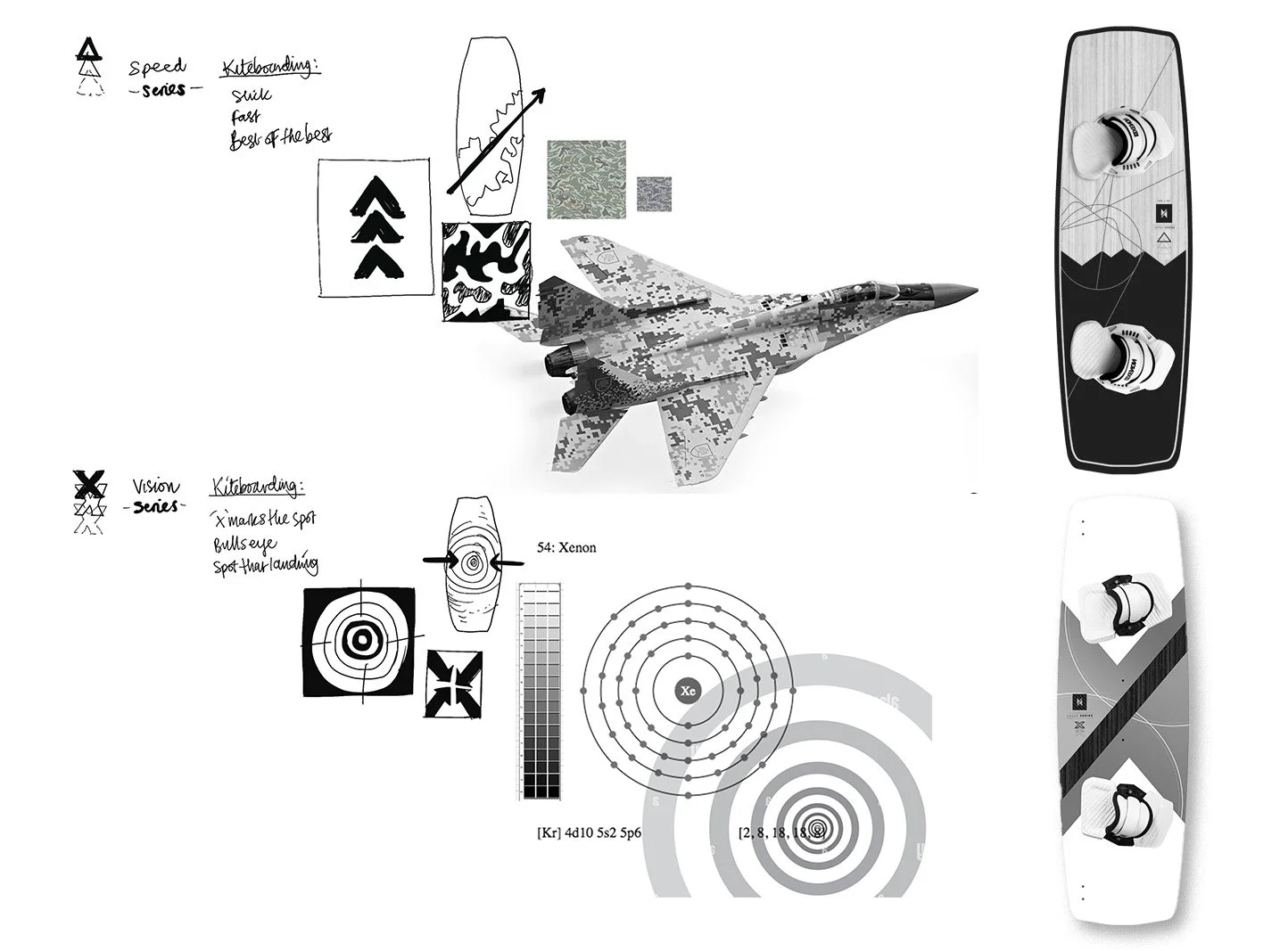
The Rayo design was based on the feelings associated with Kiteboarding. We explored ways to visualise the adrenaline rush felt by all Kiteboarders, regarless of skill level.
Flight
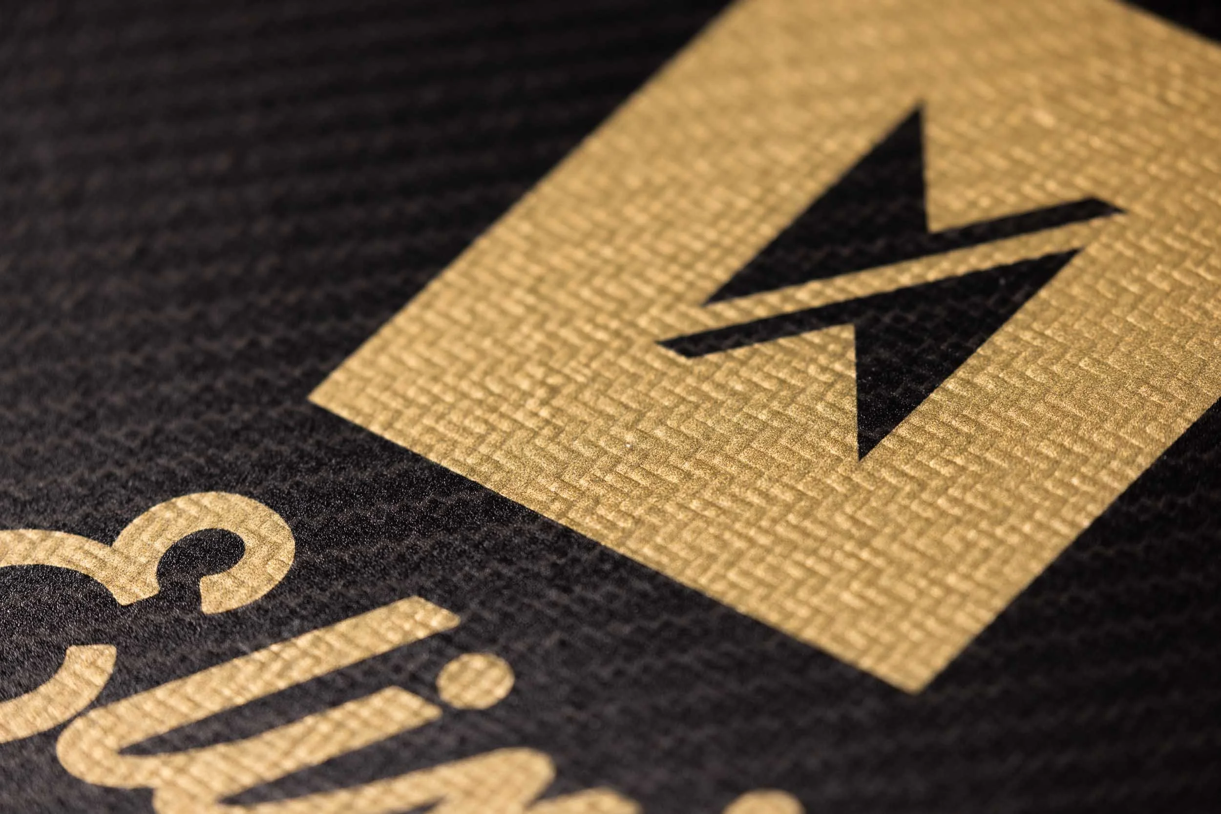
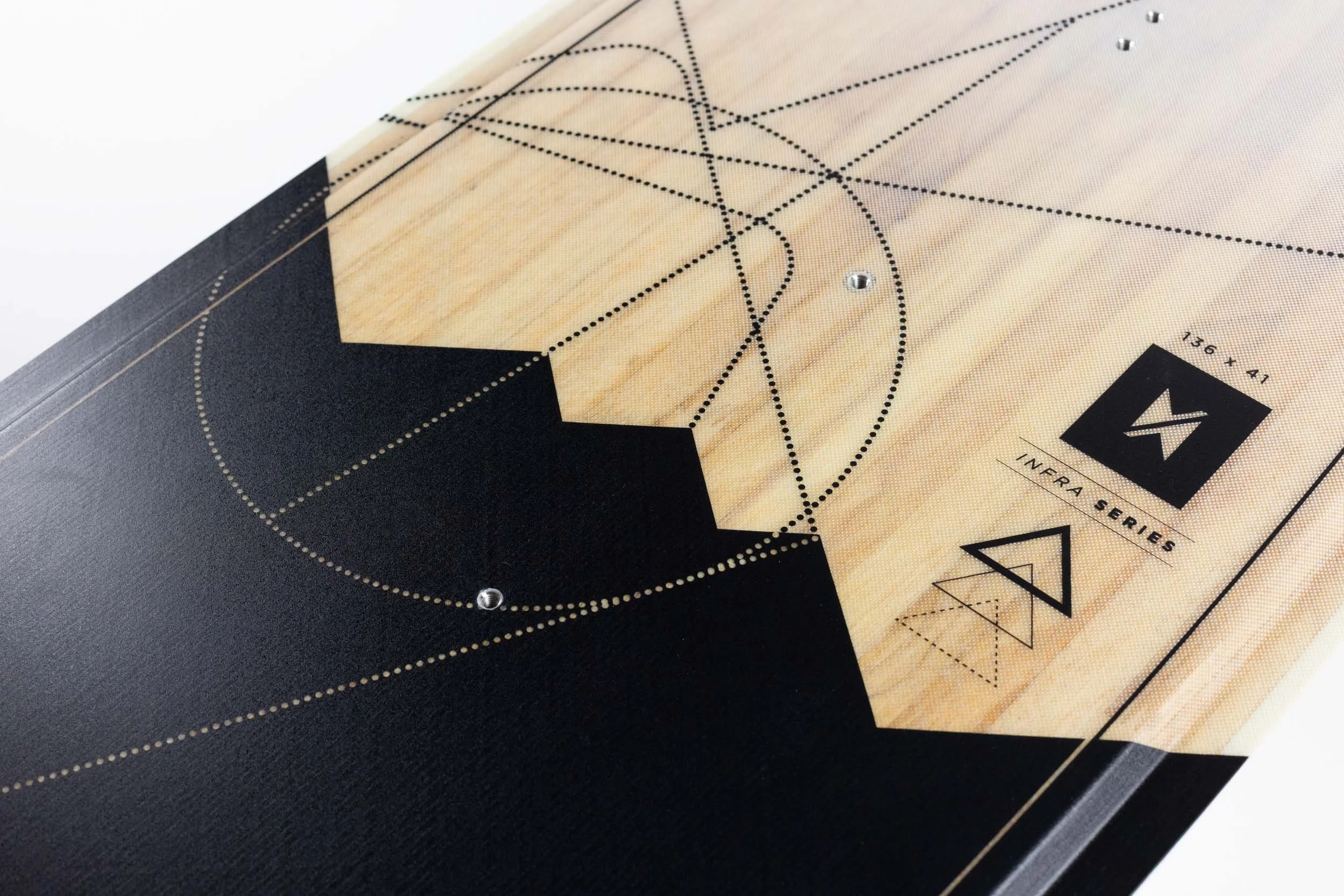
Almost all kiteboarders eventually take to the air. Its a raw form of flight, nothing else like it on the beach, they are the elite. Infra design was based on the true master of the skies, the stealth bomber and takes shapes and form from the legendary F-117 Night Hawk.

Technique
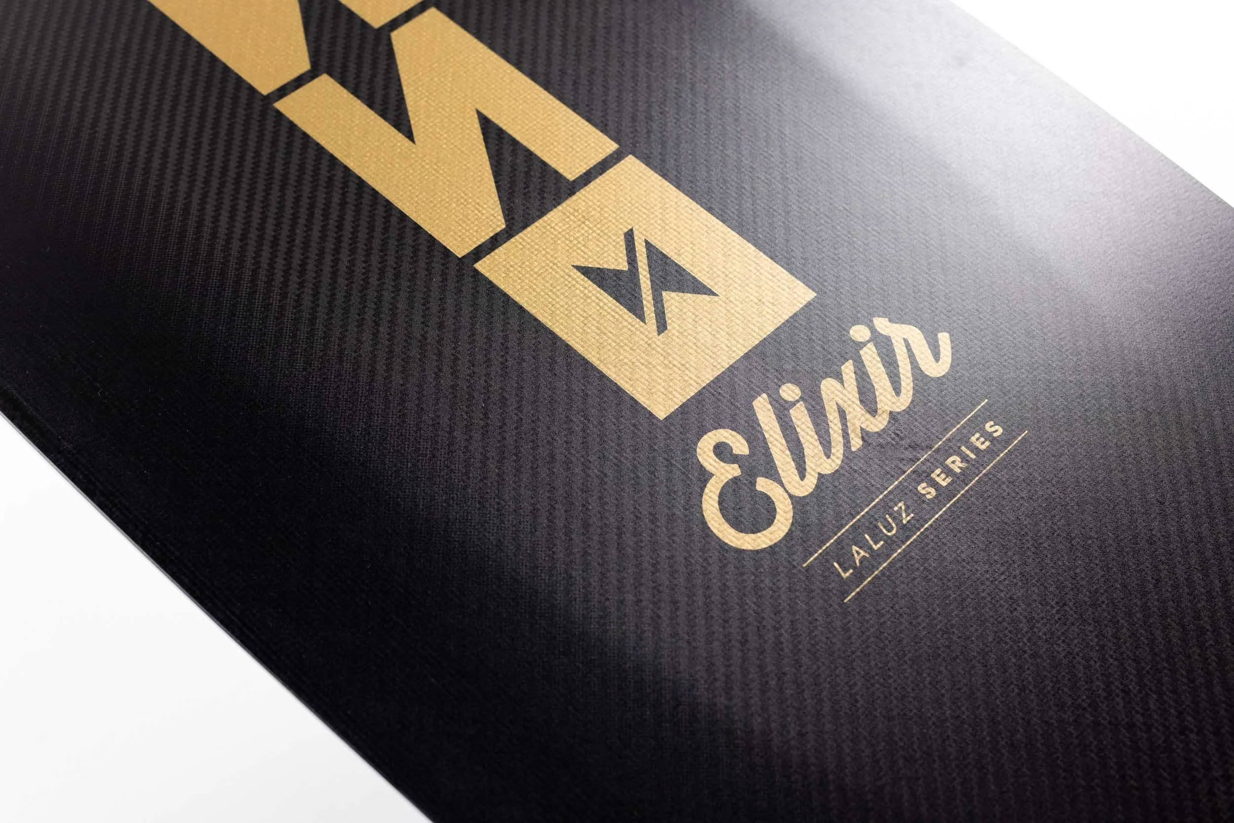
What goes up must come down. A common term in Kiteboarding is ‘spotting your landing’. For the Laluz design we explored ‘X marks the spot’ as a concept, using the Xenon logo to create an X shape positioned dead center, to the board.
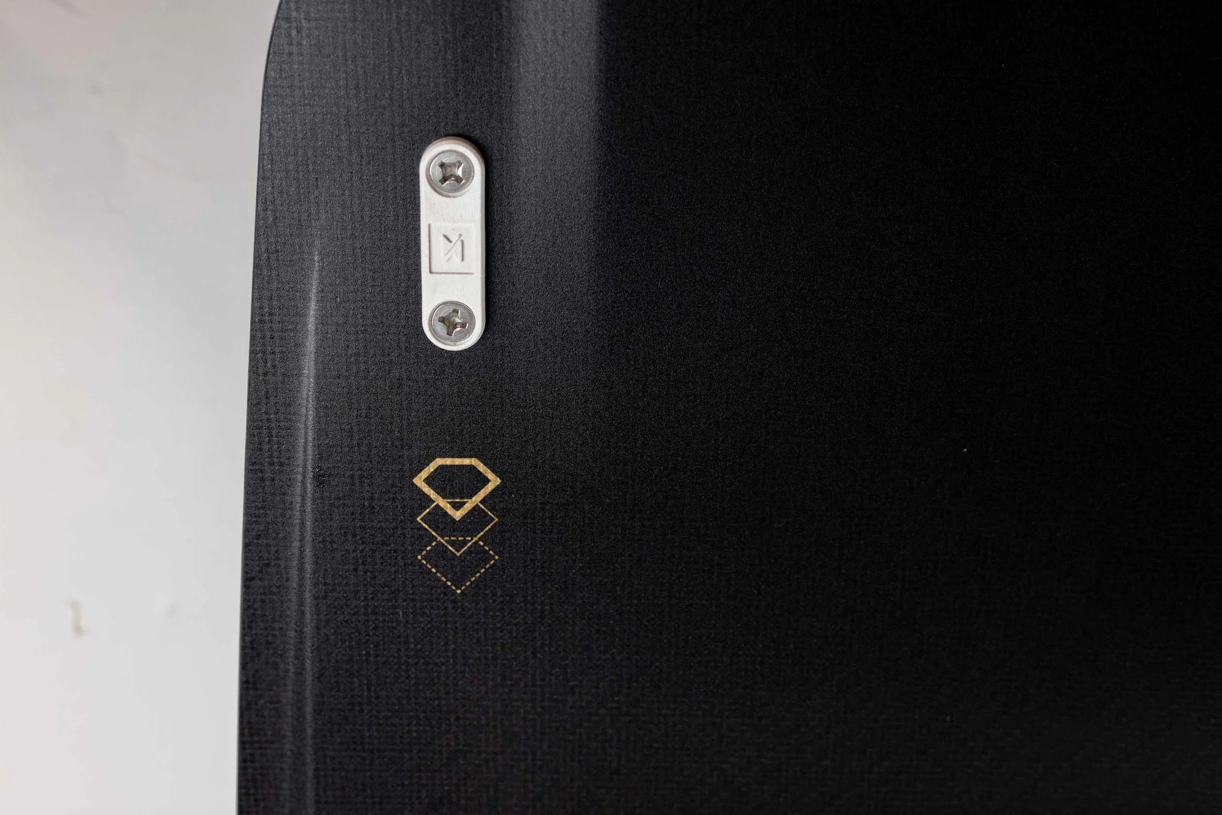
Emblems created for each family of kiteboards give riders another level of identity for their chosen style
Product Photography


The production life cycle is a long one, fraught with specific technical requirements, material constraints and tolerances. Mistakes can be costly
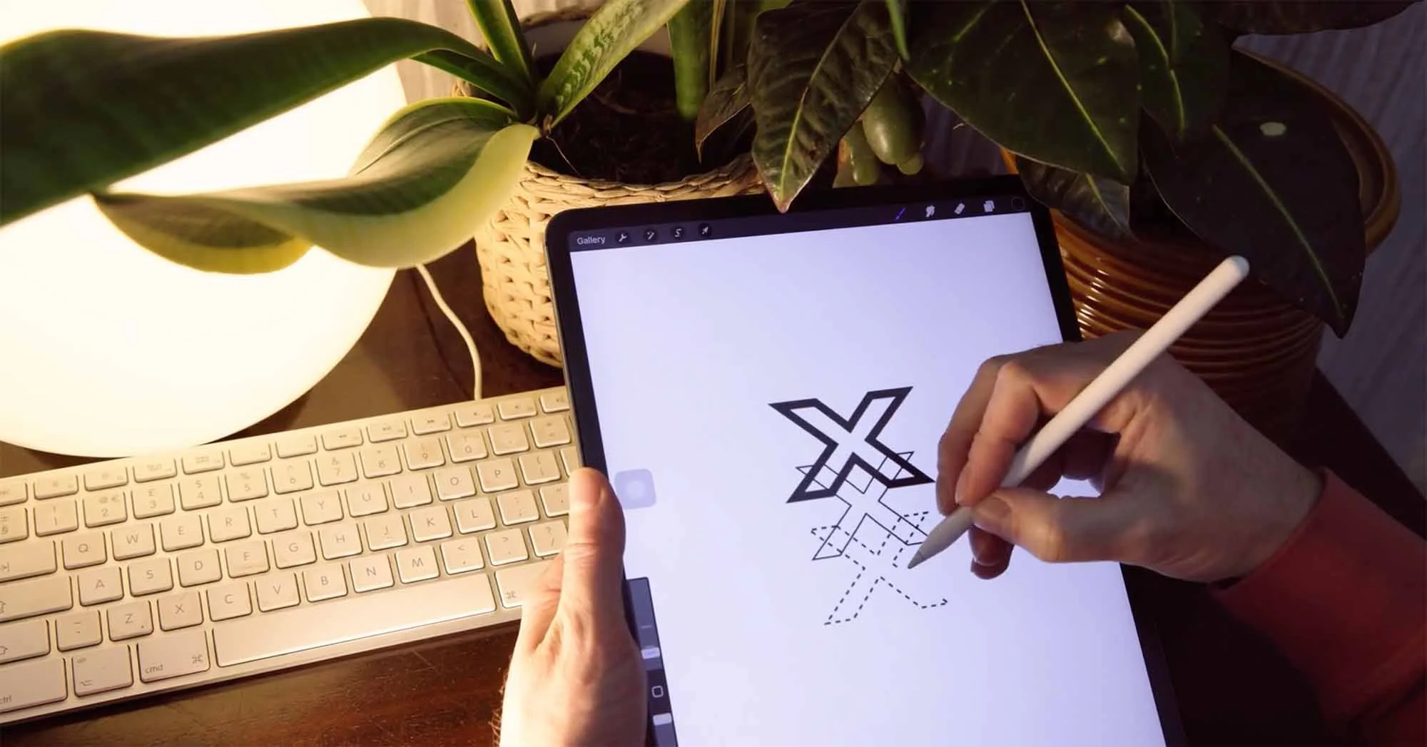
My process always starts with concept development. For this range, we wanted to push the visuals somewhere bold – something that reflected the energy of the sport and the innovation behind the boards themselves. I began with rough sketches and moodboards, pulling in influences from street art, sci-fi minimalism and the raw geometry of wind patterns.
Creating custom graphic designs for kiteboards isn’t quite like knocking up a poster or website. These boards have to stand up to everything nature throws at them – saltwater, UV rays, sand, and the inevitable dings and scrapes from sending it a bit too hard. The production life cycle is a long one, fraught with specific technical requirements, material constraints and tolerances. Mistakes can be costly.
The challenge? Making each board stand alone and work together as a family. It’s like designing a band – each member has their own vibe, but they still have to work in a symbiotic manner.

When the Ink Hits the Wood
Now here’s where it gets technical. The print process for kiteboards isn’t forgiving. What looks crisp on a screen can turn to mush when transferred to composite materials at high temperatures. Colours shift. Lines blur.
This year, one of the biggest obstacles came during prototyping. I’d spent weeks perfecting a gradient finish across two of the models – the ‘Fly’ and the ‘Rayo’ – only to find the first test prints looked muddy and lifeless. Total heartbreak.
Back to square one. After several calls with the production team (and a few long nights in the studio), we reworked the colour calibration to suit the exact resin used in Xenon’s new board construction. It was a bit of a nerdy deep-dive, but totally worth it. The final boards now have a richness and detail that really pops – even in the harsh glare of full sun.
More Than Just a Pretty Surface
What I love about working with Xenon is that it’s never just about decoration. These boards are tools – extensions of the rider. The graphics I create have to enhance that connection.
It’s easy to underestimate the power of design in sport. But when you’re out there, powering through chop or mid-loop 20 feet in the air, knowing your board looks as good as it rides adds something intangible – confidence, maybe, or just a bit of pride.
Each of these exclusive designs was created with that in mind. They’re not off-the-shelf templates – they’re the result of a real collaboration between art, engineering, and performance.
Lessons from the Process
Every project teaches you something new. This one reminded me that even after years of doing this, you can still hit a creative wall – and you can still break through it.
Designing for a sport you love can be a double-edged sword. You care more, which means the stakes feel higher. But it also gives you that extra drive to make it right. That’s what keeps me coming back.
From the initial sketches in my Bristol studio to the final splash of spray on an Andalusian shoreline, this range has been a proper journey. It’s not just a job – it’s a passion project, fuelled by years of partnership, a fair few late nights, and a whole lot of wind.
I’m immensely proud to have had the opportunity to apply my expertise to the brand. We’ve provided new design strategies, fresh flavours infused into the product range, and an elevation of quality and standards, helping to re-write the story of the brand.